Wildfire Alert Risk Explorer
Live NWS alerts + on-the-fly ML classification of Red Flag Warnings with optional local weather context and exportable results.

Live NWS alerts + on-the-fly ML classification of Red Flag Warnings with optional local weather context and exportable results.

XGBoost fraud classifier deployed as a Streamlit app — upload a CSV, tune the threshold, and export predictions.

Compare Poisson vs NB2 for RNA-seq count data — explore overdispersion, tune simulation controls, and export per-gene fit results.

Interactive K-Means clustering demo — explore segments, tune k, and visualize cluster assignments in real time.
University of Connecticut
Genomic Data Analysis Graduate Certificate (2026 - Current)Johns Hopkins University
Master of Science in Applied & Computational Mathematics (Nov. 2022 – Current)University of Colorado Denver
Bachelor of Arts in Psychology (Aug. 2015 – Dec. 2021)
Mercor
Data Science Team Lead (July 2025 - Current)Solari
AI/ML Engineering Intern (Feb. 2025 – June 2025)Johns Hopkins University
Statistics & Probability Learning Assistant (Jan. 2025 – Current)Scale AI
Mathematics Senior Reviewer/Queue Manager (Jan. 2023 – Feb. 2025)University of Minnesota
Quantum Computing Researcher (Jan. 2024 – Mar. 2024)
Machine Learning/AI Engineer Path (Codecademy)
Deep Learning Specialization (deeplearning.ai)
Machine Learning Specialization (deeplearning.ai)
ML architectures (MLFlow, TensorFlow, PyTorch, LLMs, Deep Neural Networks), Data Analysis, Data Visualization (Tableau, Pandas, Statistical Testing), Bioinformatics & Genomics (Sequence Alignment, BLAST, NGS Fundamentals, Functional Genomics, Phylogenetics, Genome Assembly/Annotation Concepts), Biological Databases & Data Integration (Gene/Protein/Sequence Databases, Annotation & Metadata), Programming for Bioinformatics (Python, R, SQL; Algorithms & Data Structures; String Manipulation), Reproducible Research & Scientific Communication (Documentation, Figures & Reporting, Ethical/Privacy Considerations in Genomics), Application Deployment on Streamlit, AWS, Azure; Git, Confluence
A production-style ML pipeline for scoring tabular transactions, built for reproducible inference and deployed as an interactive web app.
Problem
Fraud detection is a high-impact, high-imbalance classification problem. Fraudulent transactions are rare, but the cost of missed fraud is significant. This project focuses on building a practical pipeline that supports real-world inference workflows (schema validation, thresholding, batch scoring, and exportable outputs).
Goals
Build a reproducible ML workflow for tabular fraud prediction
Handle a feature schema consistently between training and inference
Deploy an interactive scoring app that:
Approach
Model: XGBoost classifier (tabular classification)
Inference design: Persist model + preprocessing + feature schema as artifacts so the demo can score new data reliably.
Key pipeline steps:
Data preprocessing + feature engineering
Model training (XGBoost)
Save inference artifacts:
scaler.joblib (preprocessing)
feature_columns.json (expected schema/order)
xgboost.json (trained Booster)
Live Demo Experience
The Streamlit app supports:
Load a sample input file (sample_input.csv)
Upload a CSV (up to 200MB)
Adjust a fraud threshold slider (controls the classification cutoff)
Preview scored rows + download results
Outputs:
fraud_probability (0–1)
fraud_prediction (0/1 based on threshold)

Technical Highlights
Artifact-driven inference: ensures the same preprocessing + feature order used in training is enforced at prediction time
Threshold tuning UI: shows how business constraints can influence classification decisions
Batch scoring workflow: supports scoring many rows and exporting results for review
Repository Structure
.
├── app.py
├── requirements.txt
├── sample_input.csv
├── artifacts/
│ ├── scaler.joblib
│ ├── feature_columns.json
│ └── xgboost.json
├── Fraud Detection 2.ipynb
└── README.md
A production-style unsupervised learning workflow for discovering natural segments in tabular data, deployed as an interactive dashboard for feature selection, cluster tuning, visualization, and exportable results.
Problem
Clustering is a core unsupervised learning task: there are no labels, but we still want to uncover structure and identify natural groupings in the data. The challenge isn’t only fitting a model, it’s enabling practical exploration of clustering choices (feature selection, scaling, K selection, and interpretability) in a way that’s reproducible and easy to understand.(This project is designed as an interactive “segmentation explorer,” not just a notebook output.)
Goals
Build an interactive clustering workflow that works out-of-the-box using a sample dataset and supports “bring your own CSV.”
Provide a practical output format: exportable clustered data for downstream use.
Make model choices explainable through:
visual cluster inspection (2D projection)
cluster size summaries
feature-level cluster profiles
Approach
Model: K-Means clustering (unsupervised segmentation)
Preprocessing design: Ensure consistent feature handling by:
selecting numeric features for clustering
cleaning invalid values (e.g., missing/infinite)
standardizing features (so distance-based clustering behaves as expected)
Key pipeline steps:
Data selection (sample dataset or uploaded CSV)
Feature selection (user-defined)
Scaling / preprocessing
Fit clustering model (K-Means)
Evaluate clustering quality (when applicable)
Visualize clusters using PCA (2D)
Export results with cluster assignments
Live Demo Experience
The Streamlit app supports:
Use a sample dataset (so the demo works immediately without external files)
(Optional) Upload a CSV and select clustering features
Tune K (number of clusters) via slider
View results instantly:
PCA cluster plot (2D visualization)
cluster counts (size distribution)
cluster profiles (mean feature values per cluster)
Download outputs:
original rows + cluster_id column for analysis and reuse
Outputs:
cluster_id (integer cluster assignment per row)
clustered dataset export (CSV)

Technical Highlights
Exploration-first UX: designed to help users choose reasonable clustering settings, not just run a model once.
Interpretability via profiling: cluster summaries reveal which features drive separation between segments.
Visualization as validation: PCA projection provides a quick sanity check for separation, overlap, and outliers.
Reproducible demo workflow: an end-to-end pipeline that runs cleanly in a deployed environment (not just locally).
Repository Structure
.
├── app.py
├── Clustering.ipynb
├── requirements.txt
└── README.md
A production-style statistical modeling workflow for RNA-seq count data that compares Poisson vs NB2 assumptions, visualizes overdispersion, and exports per-gene model-fit summaries through an interactive Streamlit app.
Problem
RNA-seq data are counts, which are often modeled using distributions like Poisson. However, real RNA-seq data typically exhibit overdispersion (variance greater than the mean), which violates Poisson assumptions and can lead to misleading inference. This project provides an interactive way to explore that mean–variance behavior and compare Poisson vs Negative Binomial (NB2) fits at the gene level.
Goals
Build an interactive explorer to demonstrate and diagnose overdispersion in RNA-seq count data
Compare Poisson vs NB2 model fit in a reproducible, scalable workflow
Support multiple data workflows for real-world usability:
Sample dataset (works instantly)
Simulated dataset (controlled overdispersion + condition effects)
User upload (tidy RNA-seq counts CSV)
Approach
Models: Intercept-only GLMs per gene
Poisson GLM (baseline for count data)
NB2 GLM (adds dispersion: Var(Y)=μ+αμ
Dispersion handling:
Estimate gene-wise dispersion 𝛼 via a method-of-moments approach using each gene’s mean/variance
Key pipeline steps:
Load counts (sample / simulated / upload)
Validate schema and types for reliable modeling
Visualize gene-wise Mean vs Variance
Fit Poisson + NB2 per gene (capped for performance)
Compare fit metrics (AIC / log-likelihood)
Export a per-gene results table for downstream analysis
Live Demo Experience
The Streamlit app supports:
Choose a data source
Sample dataset (preloaded)
Simulated RNA-seq dataset (interactive sliders)
Upload your own tidy CSV: gene, sample, count (optional condition)
Simulated controls
Genes / samples
Dispersion 𝛼 (controls overdispersion)
Condition effect strength
Random seed
Modeling controls
Max genes to score (keeps the app fast)
Interactive outputs
Data preview + quick dataset stats
Mean–variance scatter (overdispersion check)
Poisson vs NB2 fit comparison:
AIC comparison plot
Table of per-gene fit metrics
Download results as CSV
Outputs
Per-gene summary table including:
mean, var
alpha_est
poissonaic, nbaic
poissonllf, nbllf
better_model (Poisson vs NB2 based on AIC)

Technical Highlights
Educational + practical modeling: shows why Poisson often fails for RNA-seq counts and when NB2 is preferred
Three data workflows: sample + simulated + upload makes the demo immediately usable for anyone
Performance-aware scoring: gene scoring cap prevents slow deployments while still demonstrating real workflows
Clear reproducibility: modular src/ functions keep IO, simulation, and modeling logic clean and reusable
Repository Structure
.
├── app.py
├── requirements.txt
├── data/
│ └── samplecountstidy.csv
├── src/
│ ├── init.py
│ ├── io_utils.py
│ ├── simulate.py
│ └── modeling.py
├── assets/ (figures/screenshots)
├── archive/ (original exports/plots/scripts)
└── README.md
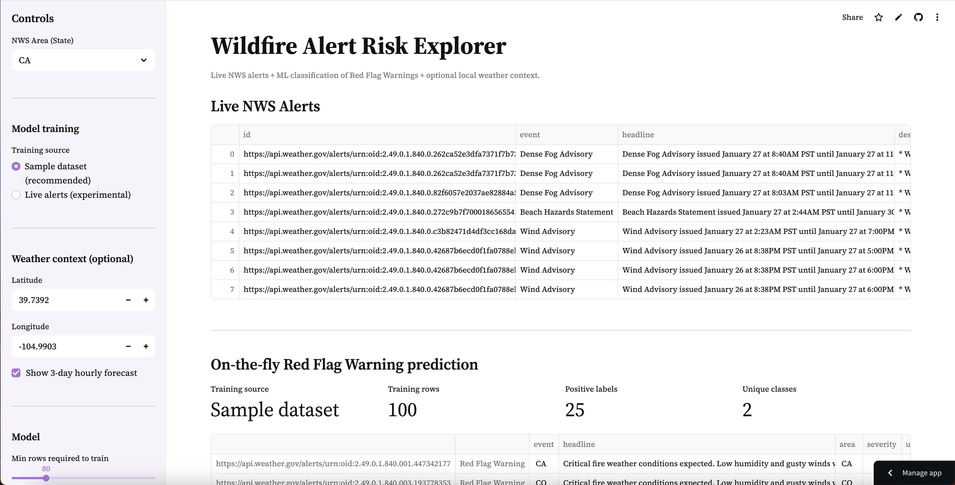
A production-style real-time data + ML workflow that pulls active National Weather Service alerts, trains a lightweight classifier to identify Red Flag Warnings, and deploys an interactive dashboard with optional local weather context.
Problem
Wildfire-related alerting is time-sensitive and text-heavy. Alerts vary in format, volume, and availability by state — and “Red Flag Warning” conditions can be buried among many other alert types. The challenge isn’t only building a model, but creating a reliable end-to-end pipeline that supports real-time ingestion, practical classification, and a clean interface that a reviewer can explore quickly.
Goals
Build a real-time pipeline that:
fetches live NWS alerts by state
normalizes and displays alerts in a readable table
Train a fast text-based classifier to identify Red Flag Warnings
Provide a stable demo experience even when live alerts are sparse by supporting:
Sample training dataset (recommended)
Live-alert training (experimental)
Add optional weather context (hourly temperature/humidity/wind) for a chosen location
Enable exportable outputs (scored alerts as CSV)
Approach
Data source: National Weather Service Alerts API (active alerts by area/state)
Model: TF-IDF vectorizer + XGBoost classifier (fast baseline for text classification)
Training strategy:
Sample dataset (recommended): uses a labeled CSV shipped with the repo so the app is always functional
Live alerts (experimental): derives labels from the alert event name when enough active alerts exist
Key pipeline steps:
Fetch live alerts → normalize into a consistent DataFrame
Build a training frame:
text = headline + description
target = 1 if event contains “Red Flag Warning” (live mode) or from labeled sample file (sample mode)
Train vectorizer + model (cached for performance)
Score alerts and display:
predicted probability (rfw_proba)
predicted label (rfw_pred)
Export scored results
Live Demo Experience
The Streamlit app supports:
Choose a state (CA, CO, OR, etc.) to view active alerts
Select training mode:
Sample dataset (recommended) for consistent behavior
Live alerts (experimental) for real-time training when enough alerts exist
Review training diagnostics:
training rows
positive labels
class diversity
View scored alerts ranked by predicted Red Flag Warning probability
Download the scored output as CSV
(Optional) View a 3-day hourly forecast for a chosen latitude/longitude to add context (temperature, humidity, wind)
Outputs
rfw_proba (0–1)
rfw_pred (0/1)

Technical Highlights
Real-time ingestion: pulls active alerts from NWS and renders them in a clean interface
Two-mode training design: sample mode ensures the demo works reliably; live mode shows realism when alert volume supports it
Fast, explainable baseline: TF-IDF + XGBoost provides strong performance for text classification without heavy runtime cost
Guardrails for reliability: minimum-row checks and “single-class” detection prevent misleading training runs
Exportable workflow: users can download scored alert data for downstream review/analysis
Repository Structure
.
├── app.py
├── requirements.txt
├── README.md
├── data/
│ └── sample_alerts.csv
├── src/
│ ├── init.py
│ ├── nws.py
│ ├── weather.py
│ └── ml.py
└── archive/
└── redflagwarning_classifier.py